
From GraphXR to Kineviz (2021-2026)
You may have seen recently that the platform that was formerly known as GraphXR, the modelling, analytical and data visualisation platform from Kineviz is now simply renamed as Kineviz. The recent triggering of this event has given me an opportunity to reflect on my journey so far and to look at the exciting future direction.
So why do we use Kineviz. 3D data visualisation is certainly addictive but it can take the unitiated time to understand and appreciate what they are seeing. This is normal. It’s like going to a remote location and seeing the broad night sky properly for the first time, you see variations and patterns but there can be so much going on that it takes time to soak it all in.
Having personally come from a 3D CAD/CAM/CAE background with forays into Plant Design, animation and GIS projects then this for me was a logical progression. Back in 2021 there were a few people dabbling in 3D in graph but no one was doing it well, that was until I met Wei and Sony at Kineviz.
So in this short blog I hope to take you on a short journey on how applying these tools to solve complex problems, in this case using existing government tabular data to demonstrates the ability to build an interactive data model, map spatial information and also link mineral deposits without requiring deep technical expertise. Ultimately, I hope to illustrate a technological leap that allows users to transform massive, disconnected datasets into actionable visual insights.
I wanted a model that a lot of people would have limited exposure to, a model that I created early on in my Kineviz relationship that had a number of people around me at the time wondering if I had lost the plot. Why would you ever want to create a model that contained over 30,000 nodes and what could you possibly gain from doing this?
The first question was an easy one to answer and that was to simply explore if I could create a “usable model” that large, and my response to the second question was I really had no idea but it seemed like a great idea at the time. For those that had been experimenting with large data sets and trying to use Bloom from Neo4j around the same time period you would know how limiting this was being locked in a 2D world (there are only so many nodes you can display on a screen in 2D and still making sense of them.
This model was to reated to better understand Mining Tenements in Western Australia. A mining tenement is an official license, permit, lease, or government authorization that gives a person or company the legal right to explore for, develop, or extract mineral resources on a specific piece of land.
The data part was the easy bit. The West Australian government through their mining oversights operation is currently known as DMIRS (Department of Mines, Industry Regulation and Safety) and they update the tenement data daily. Not having a mining background I had some very simple questions to ask like “What does the ownership of a tenement look like?” Was it one-to-one, or one-to-many? One owner to multiple tenements or potentially multiple owners of a single tenement? This question was answered by downloading a csv file and loading this into GraphXR and the journey began. Could I have done this using Excel or Power Query? Yes, but only for the simple initial questions, but more importantly they don’t look this good?
The model below shows what was later affectionately referred to upon it’s public sharing as the "Death Star". It helped visually answer the question on the structure question and gives us immediate context in terms of volume and complexity.
So if the structure was to reflect a one-to-one relationship we would see model that only had lots of spherical shapes with a tenement holder at its centre and all of the tenements they license sitting around this. You can see from this view that there are indeed many one-to-one relationships but there are also some complex one-to-many relationships in place ( have a look at that great one just just left of centre).
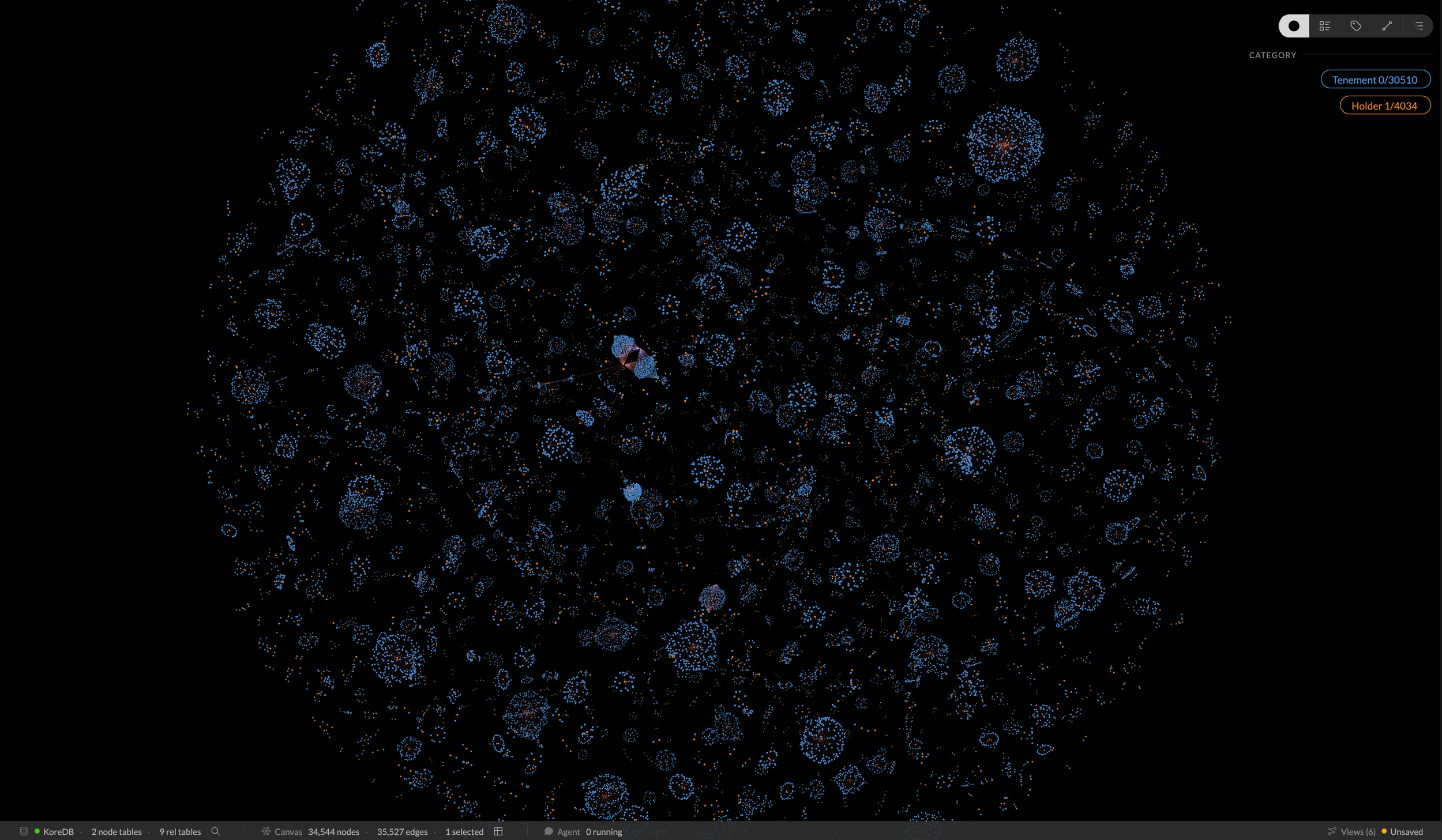
The “Death Star” Tenements Model
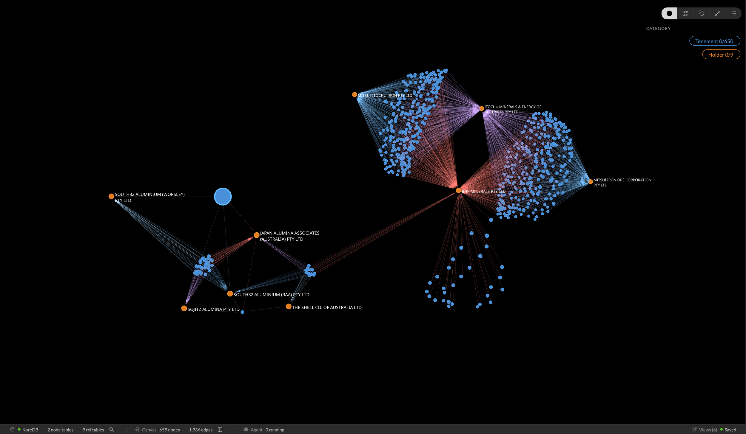
Who’s playing with who? This is that central cluster filtered down to the connected entities.
It’s a complex interplay of 650 tenements over 9 holders
Whilst this foundational model was a great step in 2021-2022, we now leap forward to today’s offering to show some of things that you and I can now do in the current release that would have required a trained and skilled analyst to do all of this in the background even at the beginning of 2026. This quantum leap is delivered through the introduction of two core additional pieces, an internal graph database (KoreDB), and an interactive agent to assist in the coding and analytics.
I personally was somewhat sceptical when this new offering was first introduced and I didn’t exactly embrace it with any great enthusiasm, but an opportunity arose and we agreed it would be good to trial it to develop and interactive Master Class that users could interact with, we ran this in conjunction with the ACS (Australian Computer Society) in March this year. This all came together well and we had lots of positive feedback so the seed was sown, now there is no looking back and we use it daily as it has become a core part of our go to toolkit.
So back to our tenement model and we start to have a better understanding of the scale and ownership structure, we can now start to explore other data within the dataset. So what about looking at this data set from other perspectives?
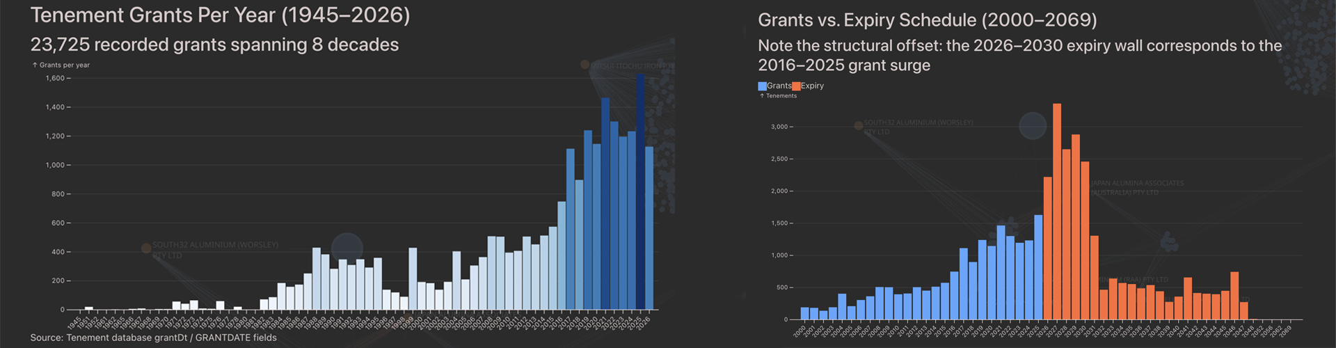
A busy last decade and a very busy renewal period looming…
Both of the above charts were generated through the use of the agent by simply prompting it to analyse the tenement data over time. You can see the rapid increase in tenement licensing over the last decade, but more importantly on the second chart (in orange) we see how many tenements are due to expire in the next few years! I hope DMIRS have visibility of this in their forward resource planning !
We are starting to get a picture and some context on the scale of the tenement management problem but tenements are also linked to physical pieces of land so how can we provide some insights on this aspect. i.e. Where are they located within Western Australia?
The original dataset that we imported from DMIRS had lots of tenement ownership information but did not contain any geo-spatial data so for that we need another data source, and fortunately there was several available for us to explore further.
But before we just plough on, we need to sit back and ask a few questions about where is the best place to store this new geo-spatial data? We could potentialy load it into the internal KoreDB but its a lot of data and realistically what other analytics are we likely to run against this geo-data? For me, it made more sense to extract the geo-data that I needed into a separate external look-up file and query this when geo-spatial information was required. This was both quick and efficient.
Whilst I could have displayed this spatial data within Kineviz, I made the decision to again use the agent to generate this spatial information into a KML file which is a native “Google Earth” file and then use it to display the tenement data. This allows all users to view this data as well as other Google Earth datasets simultaneously. Below we have a selection of mining tenements as well as operational mine data.
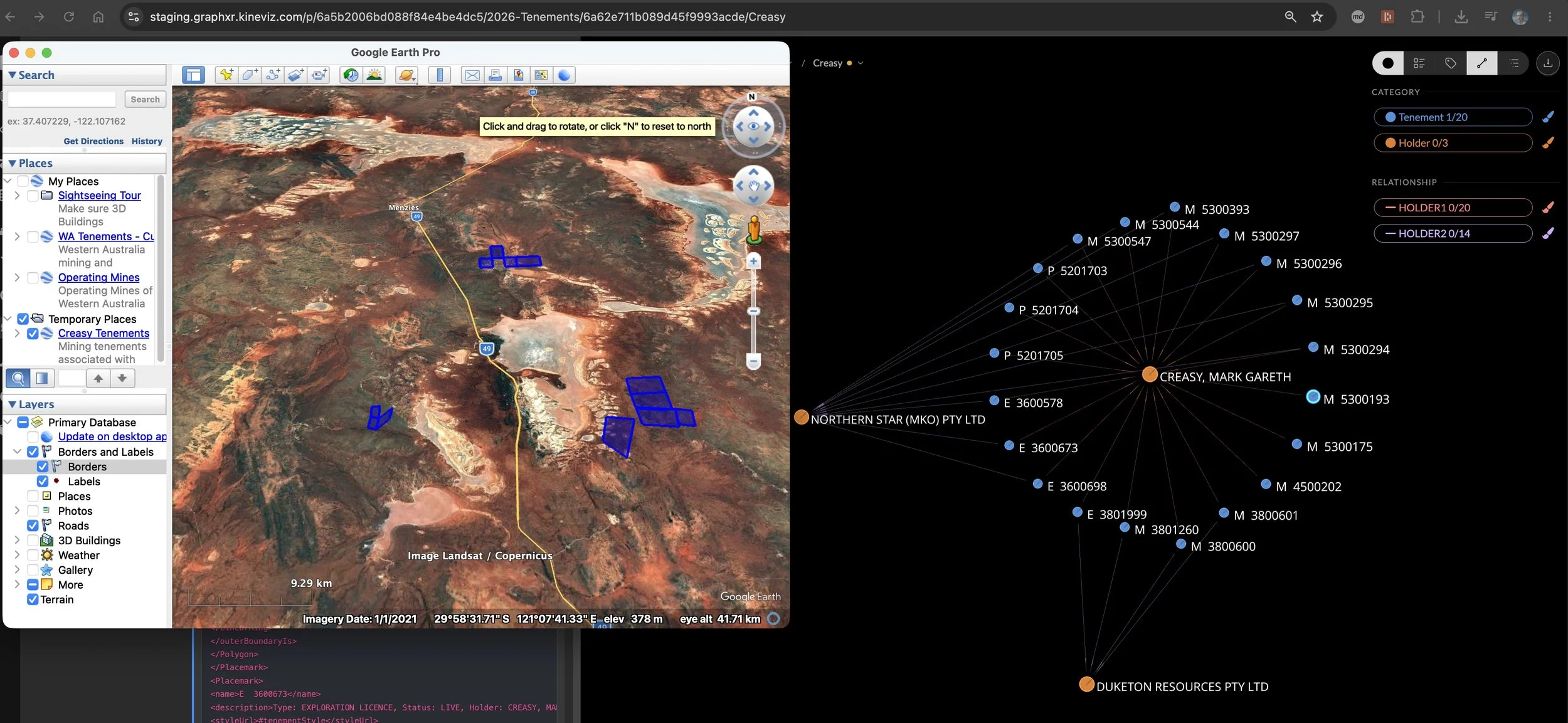
Overlay of Google Earth view on top of the logical Kineviz model
So far so good, but what are we still missing?
The fundamental reason why all of the above is in place is to maximise the discovery and extraction of minerals from these tenements. This resource data is stored in a third dataset that was also available from DMIRS and we used the agent to analyse this data and populate our tenement structures with the mineral records.
So what we can do now with this interactive model?
We can structure any of our questions around ownerships, relationships, tenement status, geolocation or mineral deposits against all tenements across the state and an example extract is shown below.
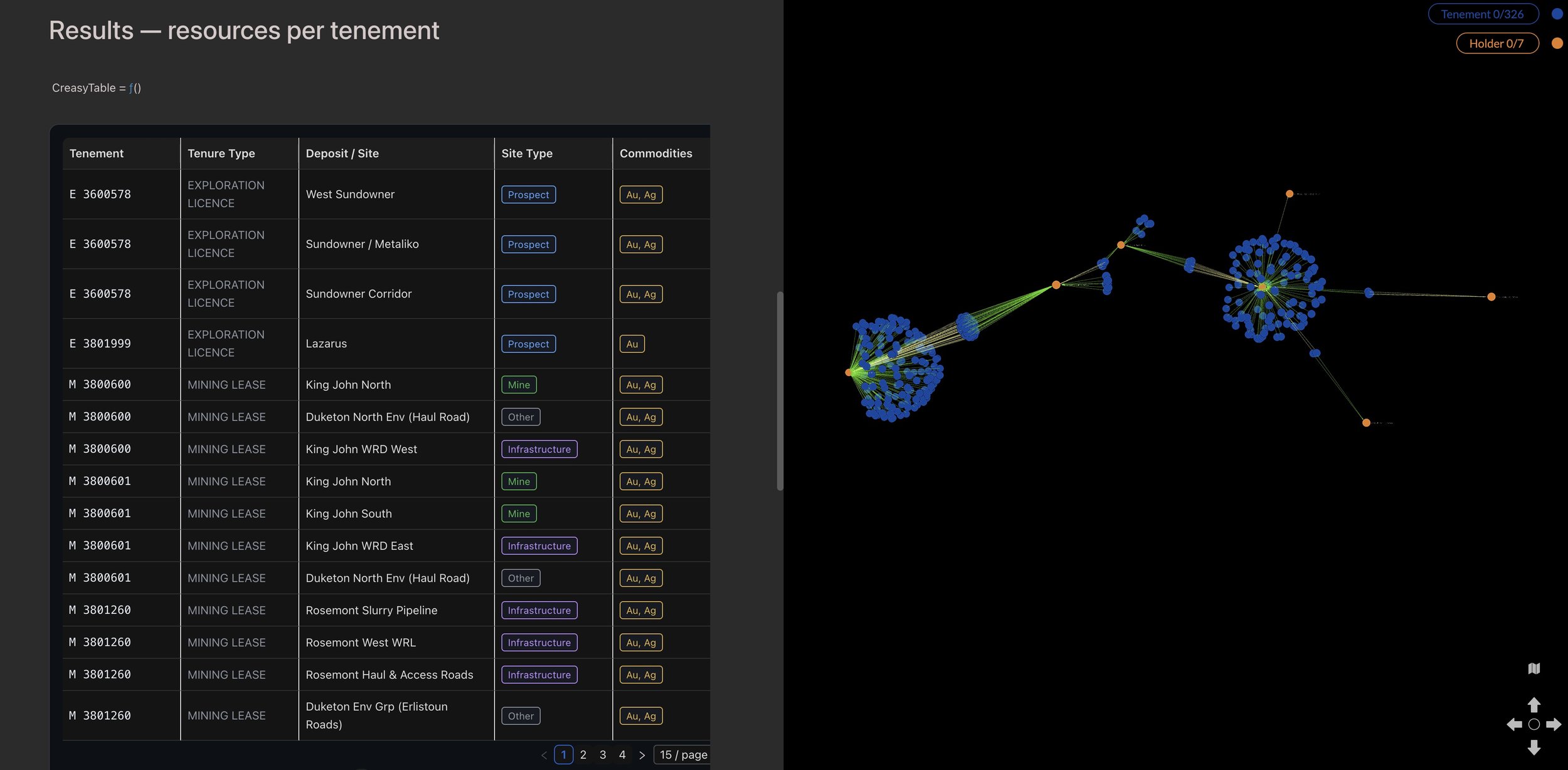
Tenement, Type, Location, Site Type and Commodities
The overlaying of disparate data sets to better understand the relationships and dependencies is incredibly powerful. If you have any questions on any of the above then please feel free to reach out to me.
I hope in the coming weeks to share some additional projects and insights, if you have a project that that you think could benefit from this approach then feel to bounce questions off me.
Thanks to all of the team at Kineviz who have been incredibly supportive (and patient) over the years and are a fantastic group to partner with.